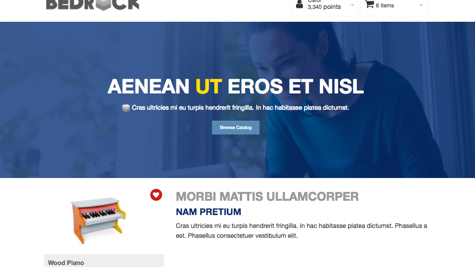
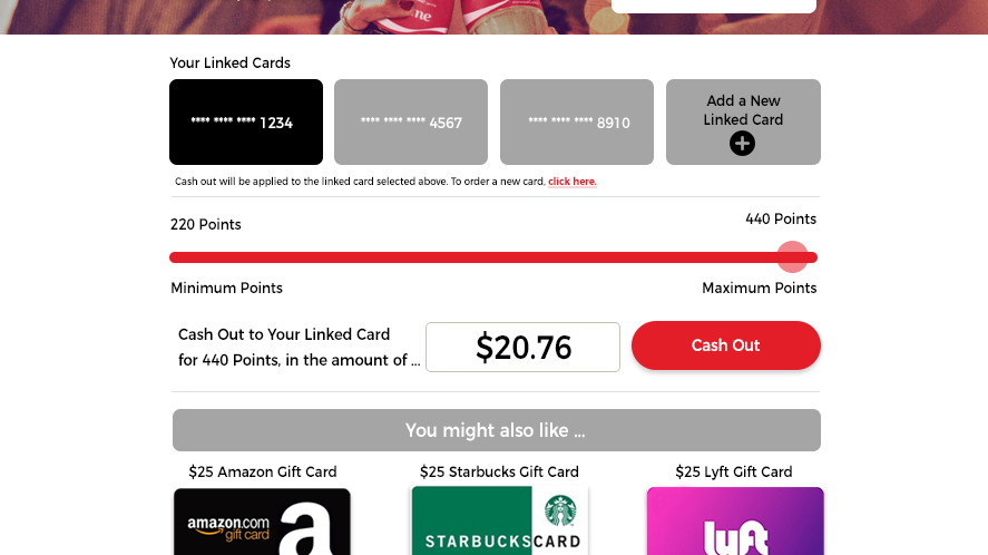
This is the standard login page where users will get the first introduction to the site. This specific example has had the basic branding treatment with client colors and logos.
I wanted to improve on the layout and take advantage of the empty space. I came up with this design that would work with any color.
The next thing was to add the client logo, navigation items, and a big clear message with the two CTAs. This was intended to work on desktop and mobile.
Keeping with the simple design, the login box expands when the button is clicked. Simple, clean, and responsive.
